How user research can help organise content
Croydon Council user researcher Mira explains how 'affinity mapping' can help arrange website content so it's easy for people to find what they need.
If you’re a follower of this blog, you should know by now that the Croydon Council website is being renovated. In case you’re not, here my colleague Will explains how we started the process. Tom, in a pre-coronavirus world, celebrated the first section going live and explained more about the project. I’ll take this chance to show how user research helped the organisation of content based on resident needs.
Writing the content
Our content designers audited the adult health and social care section and decided what needed to be edited, what needed to be merged and what could be deleted. This is done by engaging with the service owners every step of the way to be sure we’re going in the right direction. Chris blogged about what content design is and how the content has been re-written, starting with user needs.
The finished pages lived in a private website. They existed as single pages, and we needed to give them a structure before they could go live. Here’s where user research can and must happen!
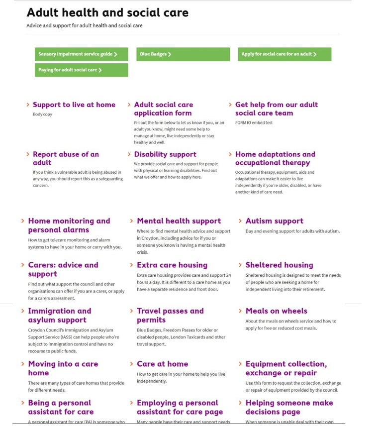
As you can see from the photo, this basic adult health and social care landing page is chaotic. Anyone will be discouraged from using it or even trying to find anything. We needed to group and organise the webpages before putting them live.
Affinity mapping workshop
To create some structure, I ran an affinity mapping exercise. For those who are not familiar with this, affinity mapping or affinity diagrams are a well-known user research technique that allows data to be organised into groups or themes based on their relation and correlation.
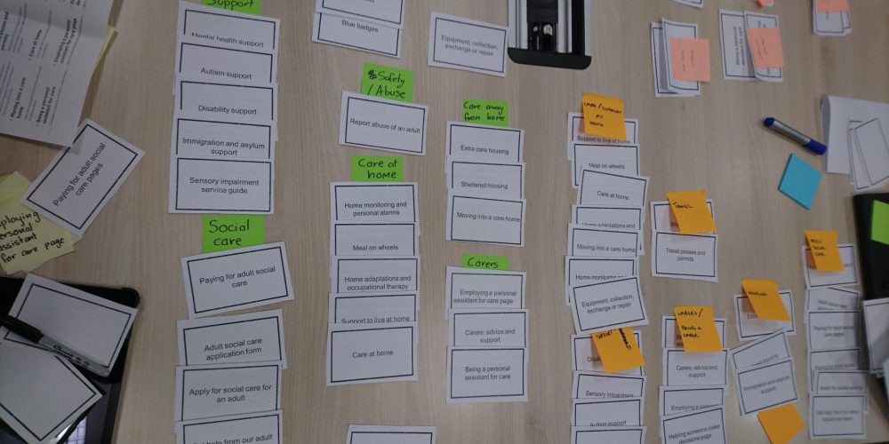
Armed with post-its and chocolate, I gathered as many team members as possible in a room. I printed the titles of each page and subpage in the adult health and social care section on a card. I distributed one set to each participant, and I asked them to (individually) group the cards following their instincts and intuition.
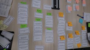
Above: Affinity mapping in progress
After the exercise we ran a group discussion, and realised we organised topics and pages in very similar ways, regardless of our knowledge of the content written.
The grouping system seemed solid, but we needed to be sure that the naming of each group was correct. Adult health and social care is an important section of the council website as it addresses sensitive topics for vulnerable users. It needs to be as clear as possible.
And just like that, a brainstorm post-its situation happened. This photo shows the result.
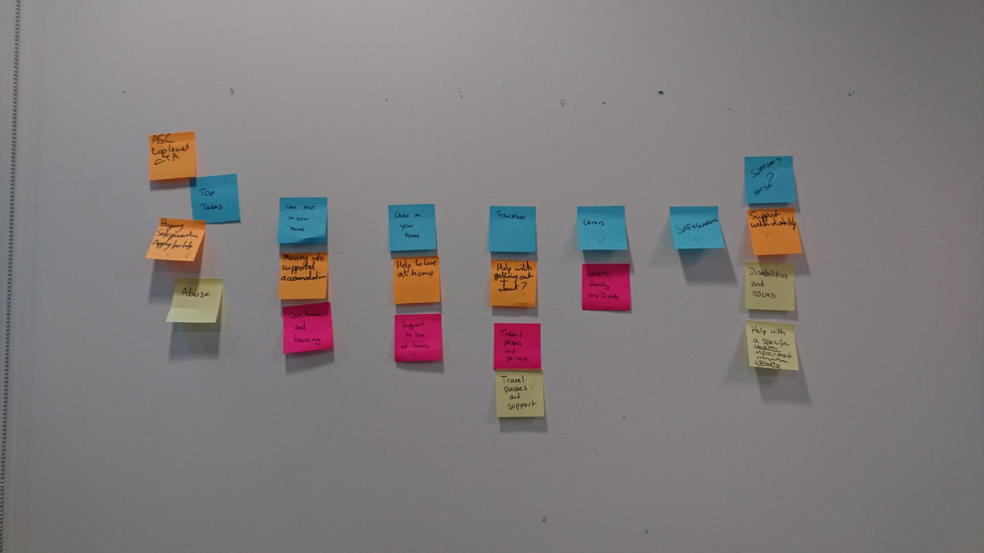
Above: New information architecture emerges
We left the room an hour later agreeing on the adult health and social care information architecture (IA), as well as the pages which needed more research. We wanted to be sure that users would understand what the council can offer them and how they can be supported. This is another story, and another blog post.
The order reigns
This the current, live, adult health social care section, after the affinity mapping workshop and after I met with some residents to understand their experiences in accessing adult social care services.
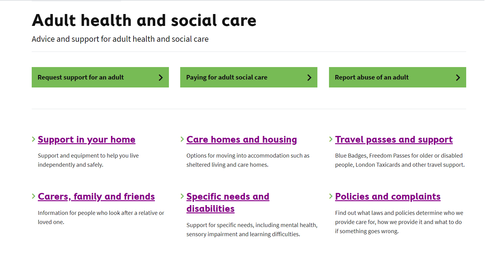
Above: Croydon’s new adult health and social care section
But the work is not done yet. We’re iterating and improving the new website constantly. I recently conducted some video calls asking residents for feedback on a new feature we’re working on. Let me tell you, it was not easy considering the lockdown situation, but we’re devoted to build a website that considers and includes as much user feedback as possible.
Get involved!
This is how user research can be done as a team sport! If you’d like to be involved in research sessions or be informed about future opportunities to help us shaping the council website, please sign up here. We’re looking forward to hearing from you.