Designing content for the council’s new website alpha
Content design is a big part of our website redesign project. Find out how we're tackling over 2,500 webpages to make them clearer and easier for users.
My team mate Will recently wrote about our progress building the new Croydon.gov.uk website. I’m here to tell you more about our content design approach.
One of the biggest questions we faced was where to start. The existing Croydon website has 2500 pages, and many have not been reviewed for a while. We had to pick one section to focus on so we could engage with the service teams who do the actual work in that area, and work with them to develop that section as an alpha version of our new website. To decide which section to start with, we took into account:
- analytics from the existing website
- volumes of calls and emails from residents
- website feedback
- council priorities
- recommendations from Residents First, a council service improvement team
Based on that, we proposed Adult Social Care as a good place to start, as it would make a big impact for the most vulnerable residents in Croydon.
Our work is based on user research and good content design principles, inspired by GOV.UK. We’re not just going to polish the old content and lift and shift it to a new design. Instead we’re writing new content that will make it easier for people to find out about and use our services.
What we’re doing
Council websites are traditionally written by the people who provide the service, so they’re experts in their field. Being experts, they write things they understand, but don’t necessarily work for end users. If a user doesn’t understand, they’ll either call us, send an email or give up. All they want to do is complete what they’ve come for, and we’re going to make it easier to do that.
We audited our adult social care pages this summer, and found that:
- some pages were out of date and no longer needed
- others gave too much detail without highlighting key information
- some pages were too long
- a few pages duplicated information from other pages
- it was often unclear how to get something done or ask for support
- it wasn’t clear how some services related to others
The audit was followed by desk research, including comparisons with other council websites, deciding what we needed to update, replace or remove. We rewrote a lot of content to make it user-focussed.
Last month we told you about our new team of people skilled in various user-centred design disciplines. One of those new disciplines is content design. While the developers are concentrating on the design of the new website, our content designers have:
- written new content that focuses on what users are looking for
- made new content that will be easy to find and use
- focussed on user journeys and how content can join up different services
- removed anything not related to Croydon services
- engaged with adult social care staff to ensure it’s accurate and find out about new services or other information that we should be providing
Here’s a quick before-and-after example.
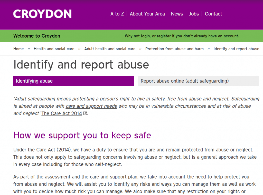
Before
This page on our website is about reporting the abuse of an adult. It’s long, gives too much information, doesn’t make it clear early enough how to report a problem and there are several other pages related to it which don’t offer anything more useful.
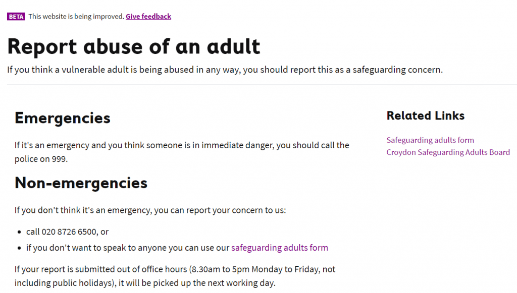
After
We felt that people who end up on this part of the website are already likely to have a concern they need to report, so we made that the priority. This new page is shorter, it starts with the key information – how to report a problem – and the only related page is a form to report a problem if someone doesn’t want to call us or the police.
What’s next
Our new user researchers are about to start testing the new pages with local people, to find out what they think. We’ll use this feedback to refine the content and maybe test again if needed. When we’re sure it’s ready, we’ll publish it on the current website as a beta, and open for feedback from anyone. The idea is continuous improvement where the website will be a regularly updated, living thing.
After the beta, we’ll be moving on to the rest of the website, section by section. One big lesson we’ve learned is to engage with services as early as possible. It’s important that they feel full ownership of the content, rather than inheriting something they weren’t involved in from the start.
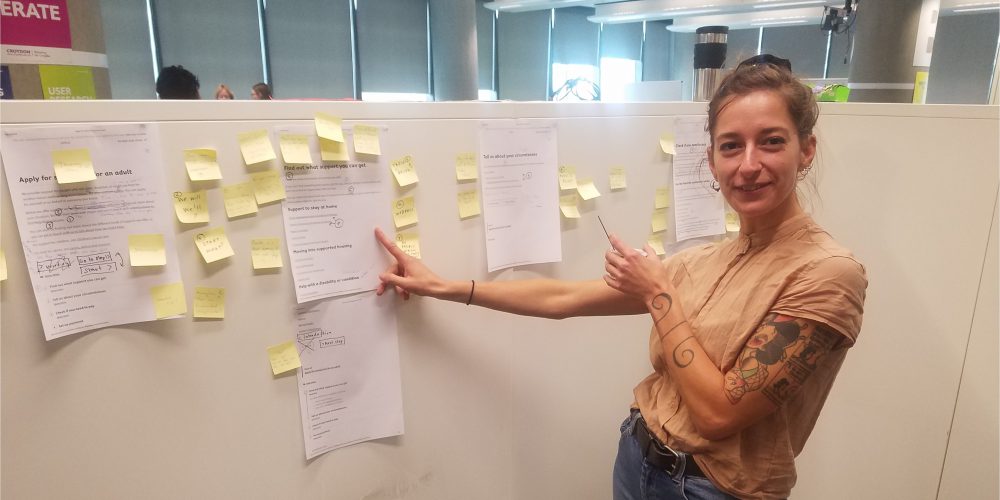
Product manager Tom made a handy flowchart to show the content design process we’ve developed so far, in a nutshell.
Get involved
We’re keen to know what you think about our plans. Please get in touch with us to give your feedback or if you’d like to be involved in our user research, testing our new pages.
1 thought on “Designing content for the council’s new website alpha”
That’s so much better!